

You’ve spent months perfecting your app. The UX is smooth, the colors are on-brand, and beta testers are obsessed with it. Then it hits the App Store — and the downloads trickle in like a leaky faucet.
Nine times out of ten, the culprit isn’t your app. It’s your screenshots.
App store visitors make snap judgments in under three seconds. Your visuals either hook them or lose them. That’s where a great phone mockup becomes less of a design nicety and more of a conversion weapon.
Why Mockups Outperform Raw Screenshots
Flat screenshots show features. Mockups tell stories.
When someone sees your UI floating inside a beautifully rendered device, placed against a clean gradient or a lifestyle scene, their brain does something interesting — it projects itself into the experience. “That could be my phone.” That’s the psychological hook that drives taps.
Raw screenshots, by contrast, feel clinical. They say “here is a feature.” Mockups say “here is your life, improved.”
The Anatomy of a High-Converting Mockup
Not all mockups are created equal. Here’s what separates the ones that convert from the ones that blend into the noise:
- Hierarchy matters: Place your most compelling screen first. Think of it like a headline — if the first frame doesn’t earn attention, the rest won’t get seen.
- Consistency in angle and lighting: Mixing isometric views with flat front-facing shots creates visual chaos. Pick a style and commit.
- Breathing room: Overcrowded compositions tire the eye. Let your UI breathe inside the device frame.
- Color alignment: The mockup’s background palette should echo your app’s brand colors, not fight them.
- Readable text overlays: Captions should be short, punchy, and large enough to read on a small mobile screen within the store.
Real-World Applications: Mockups in Practice
Theory is one thing. Let’s talk about how teams actually use mockups to move the needle.
Fitness apps use bold, energetic mockups with multiple device angles to showcase workout tracking dashboards and progress charts simultaneously — giving users a complete picture of the experience before they download.
Fintech startups often opt for ultra-clean, single-device compositions on white or soft-grey backgrounds. The minimalism signals trust and professionalism — crucial in a category where users are handing over sensitive data.
Gaming studios go loud. They layer phone frames over illustrated environments, letting the device become part of the world rather than just a container for it. The mockup is the marketing asset.
Productivity tools use side-by-side device arrangements — sometimes a phone and tablet together — to demonstrate cross-platform capability and feature depth at a glance.
Each of these approaches starts with the same question: what does my user need to feel in order to hit download? The mockup is the answer, rendered in pixels.
Phone Mockups on ls.graphics
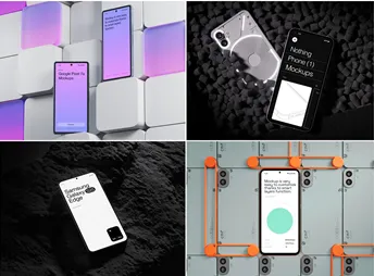
ls.graphics has carved out a strong reputation among designers who won’t settle for generic. Their phone mockup library features premium-quality assets with ultra-realistic rendering that holds up under scrutiny — no plastic-looking screens or flat shadows.
What makes their collection genuinely useful is the structure: organized layers make customization fast, while a variety of shooting angles lets you build depth across your store listing. Multiple color styles and clean, minimalistic compositions mean your brand stays front and center rather than competing with the device.
The Edit Online feature is a genuine time-saver — no Photoshop required. And with a large selection of free scenes available, you can test the quality before committing.
Common Mistakes to Avoid
Even great mockups get undermined by poor decisions around them:
- Placing illegible 8pt UI inside a small device frame and expecting users to squint
- Using generic stock lifestyle photos that have no connection to your actual app
- Forgetting to localize mockups — different markets respond to different visual languages
- Ignoring dark mode variants when your app supports them
- Reusing the same mockup angle across all screenshots
No matter how polished your individual mockups are, the listing works as a sequence, not a collection of isolated images. Each frame should hand off momentum to the next — think of it less like a photo gallery and more like the opening five seconds of a trailer.
Conclusion
Your app store listing is a landing page with a three-second attention window. Every visual choice either earns a tap or loses one. Investing in high-quality mockups isn’t a luxury — it’s a conversion strategy disguised as design work.
Whether you’re launching your first app or refreshing an existing listing, the tools are available to make your screenshots genuinely compelling. Start with a solid asset library — ls.graphics is a strong place to begin — and build your visuals around the story your user needs to see. Good screenshots don’t just show your app. They sell the version of life your app m